Air Pollution by the First-Light of Day

Videos from NASA’s Scientific Visualization Studio reveal the brilliant view from the agency’s newest pollution-detecting sensor.
This rectangular image shows a visualization of the TEMPO sensor scanning North America. The globe of Earth is depicted in shades of gray with North America colored in blues, oranges, purples and black. The first-light data shows high levels of nitrogen dioxide--indicated by darker colors--over multiple urban areas across the U.S., Canada, Mexico, and the Caribbean.
Image Caption

This visualization of TEMPO sensor first-light data shows high levels of nitrogen dioxide (indicated by darker colors) over multiple urban areas across the U.S., Canada, Mexico, and the Caribbean. Credit: NASA’s Scientific Visualization Studio.

On August 2, 2023, The Tropospheric Emissions: Monitoring of Pollution (TEMPO) instrument collected its first six scans of the atmospheric gases and particles floating over North America. The visualizations NASA released of these first-light nitrogen dioxide data were detailed and vibrant in their depiction of nitrogen dioxide levels across the continent, and provided eye-popping evidence for what a powerful tool TEMPO will be for understanding and reducing air pollution.

The TEMPO instrument is designed to record hourly measurements of pollution across North America during daylight. Technically, TEMPO is a high-resolution, UV-visible spectrometer that measures direct and reflected sunlight from its perch aboard the Intelsat 40e geostationary communications satellite orbiting in synch with the United States. Scientists are using TEMPO to collect data for measuring atmospheric concentrations of ozone (O3), nitrogen dioxide (NO2), and other major pollutants. These data will help pinpoint areas of pollution or their sources to improve air quality forecasting, protect public health, understand climate change processes, and other important science. The mission is a collaboration between NASA and the Center for Astrophysics | Harvard & Smithsonian (CfA) in Cambridge, Massachusetts.

Processing the Data

The story of how TEMPO’s first-light visualizations were made begins with Dr. Caroline Nowlan, a CfA atmospheric physicist on the TEMPO team. Nowlan performed the first checks and calculations on the data to process them into meaningful NO2 measurements. The data were processed to NASA’s Level 2 standard and included geolocated measurements of trace gases and clouds.

“The data were geolocated with Geostationary Operational Environmental Satellites [GOES] data, then processed in three somewhat distinct steps,” said Nowlan. “The first step was finding what’s called the slant column density, which is the total amount of gases absorbing or scattering sunlight through a column of the atmosphere.”

The next step was to convert that measurement to a vertical column so that the total amount of NO2 over a particular location through the entire atmosphere could be determined. This is done by performing calculations to determine the air mass factor, which describes the ability of photons to freely travel through the atmosphere.

The final step was to subtract the levels of NO2 present in the stratosphere to determine how much of the gas was present in the lower troposphere, where it’s a harmful pollutant.

From there, Nowlan was ready to share the data with the staff of NASA’s Scientific Visualization Studio (SVS) at Goddard Space Flight Center in Greenbelt, Maryland. The SVS team are experts in computer and Earth science, aerospace, digital animation and other fields, and use their expertise to produce visualizations, animations, and images that promote a greater understanding of Earth and space science. The studio works closely with scientists—both within the NASA community and within the broader academic research community—to create high-quality, data-backed visualizations.

“I was really lucky because they're used to working with NetCDF-formatted files already,” said Nowlan.

NetCDF, or Network Common Data Form, is a popular file format for storing multidimensional scientific data such as temperature, humidity, pressure, wind speed, and many other measurements. “I provided them with the same TEMPO data files our science team uses. It was really easy to work with them,” said Nowlan.

Visualizing the Data

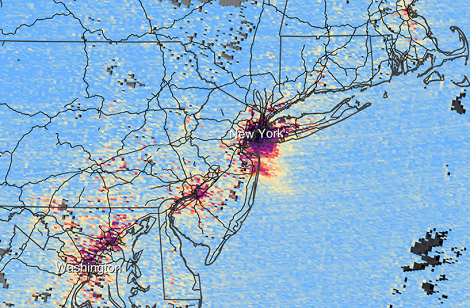
rectangular image showing the U.S. East Coast. Red/yellow areas extending from NY City to Washington, D.C., indicate areas of high NO2 concentrations.
Image Caption

This zoomed in image of a clip from the TEMPO visualization shows nitrogen dioxide levels around New York City on August 2, 2023. The SVS team created clips of a few major U.S. cities to help local news producers and others show the relevance of TEMPO’s data to their areas. Credit: NASA’s Scientific Visualization Studio.

Once the SVS team had the TEMPO data, the team turned it into animated visualizations using what amounted to a four-step process of data processing, 3D rendering, iterating with scientists and producers, and, finally, publishing.

Visualizations can be completed by one person or an entire team and take anywhere from a couple of days to a number of months depending on the project’s complexity and timeline. The initial TEMPO visualization project was a team effort that took about a week to complete

The first step of data processing was handled by SVS scientific visualizer Cindy Starr. Starr refined the data provided by Nowlan down to just what was needed to prepare it for use with 3D-visualization software. She had what amounted to a head start on the project because she had been working with TEMPO NO2 proxy data during the summer to create a visualization for the upcoming and similar Geostationary Extended Observations (GeoXO) mission. Proxy data are used to simulate the spatial and temporal resolution of the data prior to launch.

“The groundwork was already laid because I’d created a TEMPO data infrastructure to use it to show how the GeoXO geostationary satellite will collect data,” said Starr. “Once we had real TEMPO data, we found that they were only a little different from the initial TEMPO proxy data used for the GeoXO project—there were just some different variables that we could pull in—which meant it was going to be easy for us to work with the new data because we already had experience with them.”

Once Starr finished refining the data, she handed them to fellow SVS team member and scientific visualizer Trent Schindler to ingest into their 3D graphics tools to transform the data from numbers and letters into colors, shapes, and scenes of TEMPO at work.

“We use a lot of the same 3D and graphics software they use in Hollywood, such as Maya, Houdini, and the Adobe Creative Suite,” said Schindler. “Half of the tools we use are actually in-house scripts and programs people in our studio have created to help bring the datasets into the animation software and interpret them.”

Schindler used the scripts and 3D software to plot and color the data and produce a draft video of TEMPO’s six original scans of the United States.

Kel Elkins, a SVS data visualization programmer, then handled iterating the video with TEMPO’s scientists to get the details just right.

“One request from the scientists was to zoom in on regions of the U.S. that would be good examples of what the data show,” said Elkins. “I created scenes where the camera pushes into locations on the East and West Coast, and Gulf of Mexico to show the six scans close up.”

Elkins also created clips of NO2 levels over specific areas, such as Chicago and Los Angeles, that would make it easy for local television news producers and other professionals to literally show TEMPO’s relevance to their audiences.

The videos were published on August 24 and have generated a lot of excitement for TEMPO and the SVS team’s work since then.

“It’s been fun to see how the release of the visualization just kind of took off and started showing up in all sorts of places, such as different news outlets, websites, and videos,” said Elkins. “It’s great to see people get really excited about this brand new super-high-resolution data from NASA.”


TEMPO Data Coming Soon

TEMPO’s high-resolution data will be archived at and distributed by NASA’s Atmospheric Science Data Center (ASDC). ASDC plans to have validated and processed data available in Spring 2024. More details about TEMPO data and how they can be accessed and used will be presented in an upcoming Earthdata article.

Details

Last Updated

Published

Data Center/Project

Atmospheric Science Data Center (ASDC)