On July 12, 1993, a 61-year-old man with Parkinson’s disease was found dead in Philadelphia in his hot, unventilated apartment. A 70-year-old woman was also found dead in her home with no air conditioner, the fan off, and the windows closed. The room was 130 degrees Fahrenheit. Outside it was 96 degrees.
The 1993 Philadelphia heat wave killed 118 people. In the United States, about 620 people die yearly from heat-related causes. Climate scientists predict global temperatures to go up. And cities face the additional challenge of heating up faster and hotter than surrounding non-urban environments. Known as Urban Heat Islands (UHIs), these centers of concrete, high-rises, dark roofs, and car exhaust can add 11 to 14 degrees Fahrenheit to an already hot summer.
Cities like Philadelphia are responding. A group of researchers had an idea: if they could map the most vulnerable sections of a city, where it gets the hottest and where the most sensitive populations reside, then outreach and adaptation measures could focus on those neighborhoods. “Those efforts might have the highest bang for the buck,” said Natasha Sadoff, a geographer and social scientist at the Battelle Memorial Institute in Ohio.
Planning for cool
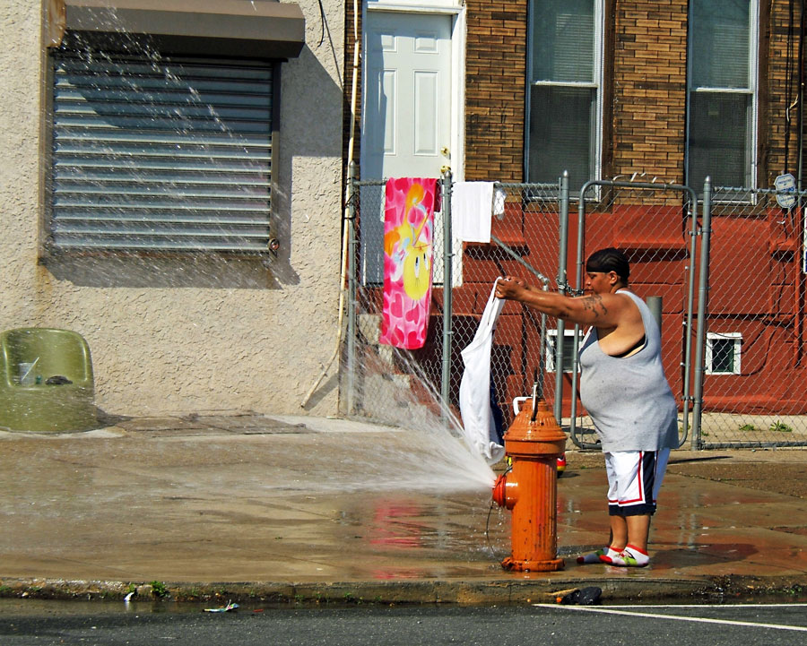
The researchers started in the city of brotherly love. “Philadelphia is already very active in climate change adaptation,” Sadoff said. After 1993, it became the first city in the country to begin a heat-health watch program. Social services ranged from opening cooling centers, handing out water bottles to the homeless, going door to door to check on people, and switching on the power to late electricity payers. But city adaptation measures take years.
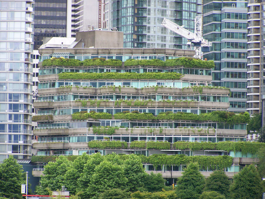
Besides higher downtown temperatures and less nighttime cooling, the UHI extends its warmth beyond the city. Rainwater heats up on dark rooftops, rolls off hot pavement, enters storm drains, and pours several degrees hotter into nearby waterways, causing certain fish populations to plummet. So Philadelphia implemented greening efforts, ripping up unneeded pavements, planting rain gardens to collect stormwater and increasing green roofs, where living vegetation covers the tops of buildings to cool the city and mitigate runoff.
City officials were keen to know how their city adaptations were paying off. How could organizations effectively target their outreach programs? Could small changes on the block level affect a neighborhood’s temperature?
Those answers were exactly what Stephanie Weber, the lead scientist on the study, was hoping to find. The study set up an advisory committee consisting of about a dozen people from researchers, city officials, and utility representatives. She said, “We want to show people that data can be incorporated into simple policies for decision makers to use.”
But first, Weber needed to know how hot Philadelphia got. She took temperature data from ground-based thermometers, but since they are sparse, she added data from the Moderate Resolution Imaging Spectroradiometer (MODIS) instrument on NASA's Aqua satellite, offered through NASA's Land Processes Distributed Active Archive Center (LP DAAC). Weber was able to get daily temperatures on a neighborhood scale, between 500 meters and 1 kilometer (0.3 to 0.6 mile) resolution, going back more than ten years.
“Now we had a quantity,” Sadoff said. Between 1980 and 2013, the number of heat wave days in urban Philadelphia increased from four to twelve days, while non-urban areas consistently experienced five days per year across the same time period. In addition, they found nighttime temperatures are not dropping like they used to, so people have less respite from heat. Sadoff said, “Having this information allows city officials and organizations to better understand the problem and to seek out funding to address it.” Still, which sections of town felt the heat the most? Who was at a higher risk?
Boiling over
To identify the most sensitive populations, the researchers chose four criteria: the percentage of people living below the poverty line, households with individuals age sixty-five or older living alone, low high school graduation rates, and homes built before 1960. Those buildings typically lack energy efficiency and cooling systems. “The lower the socioeconomic status, the more vulnerable the population because they have less access to proper care. So risk of dehydration and overheating increases,” Weber said.
Residents in poorer neighborhoods also suffer the ripple effect of poverty. “With the added risk of living in a high-crime area, people might not open their windows at night to cool off a house,” Weber said. They have fewer trees, so less shade and less evapotranspiration—nature’s form of air conditioning. “They may also have less access to clean water,” Weber said, “and with no filtration system, they may not feel comfortable drinking the tap water.”
Hydration boosts sweating. And without sweat, the body cannot cool. Once the body reaches an internal temperature of 104 degrees Fahrenheit, heat stroke may occur, even death. In humid climates, sweating becomes ineffective because moisture in the air slows evaporation. The elderly, who make up 40 percent of heat-related deaths in the United States, are less efficient at regulating their temperature. Children up to four years old, people with weak hearts, and those on certain medications are also particularly vulnerable because their bodies have a harder time handling the heat.
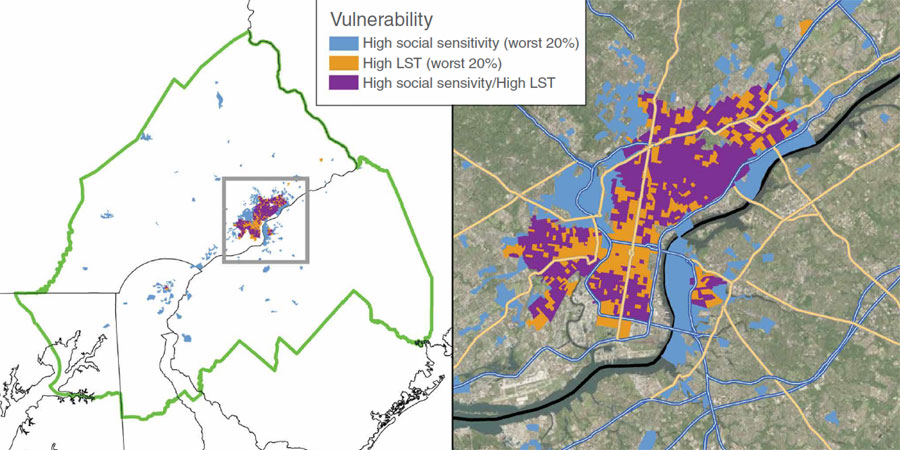
Once Weber and her team identified the most sensitive neighborhoods, they overlaid the MODIS map for heat exposure and found that 10 percent of Philadelphia’s population lived in the most vulnerable areas. “That’s a pretty high number and that’s only using four of the social sensitivity measures we chose,” Sadoff said. The number could go up or down depending on selected criteria, but 10 percent of a 1.56 million population is a significant amount: 156,000 people. “It’s meaningful to have a map that shows pretty clearly in red that this entire neighborhood or portion of the city is vulnerable,” she said.
Cooling the body is the best recovery. Weber said, “The neighborhoods we identified, the city already knew as vulnerable. But being able to identify the most vulnerable within that socioeconomic group was helpful from a policy and programming standpoint.” Targeting those populations equates to lives saved. Neighbors helping neighbors and outreach programs—cooling centers, handing out water, and heat exposure education—are the best bet.
On the flip side
To help city officials determine whether their greening efforts have made an impact on temperature, the researchers also looked at MODIS Normalized Difference Vegetation Index (NDVI) data, which measures the degree of green, or vegetation, in an environment. Would the increase in NDVI from greening efforts lead to decreases in Land Surface Temperature (LST)? They found it is still too early to tell because it takes years for trees to grow to maturity. In addition, with a 1 kilometer (0.6 mile) resolution, LST satellite imagery is best suited for neighborhood-level, rather than block-by-block readings. But the team did find a correlation between NDVI and LST, if only in the reverse.
A certain pixel on the map showed an increase in LST and a very large decrease in NDVI. “So I went to Google maps,” Weber said, “and a very large building popped up.” Looking at imagery from past years revealed the construction of a warehouse. Once the building was constructed, LST went up and NDVI went down. “It’s a reverse example of what we were hoping to see. We want to see positive effects,” Weber said. Still it is a good demonstration of how small changes can have large temperature implications.
Ultimately, the research team wants to repeat the LST analysis for other cities and turn their analyses into an online tool, so worldwide policy makers could select criteria and see the vulnerability of certain neighborhoods or populations. Urban heating is a global issue. In Europe, there is little to no air conditioning. Recent summers have been some of the warmest since Roman times. In 2003, three months of relentless heat killed 70,000 Europeans, with France being hit the hardest. Afterward, France implemented a heat wave plan, with one simple strategy of calling at-risk people. Incorporating policy-changing data into practical tools may be the first step in helping cities around the world cool off.
References
de Sherbinin, A., M. Levy, E. Zell, S. Weber, and M. Jaiteh. 2014. Using satellite data to develop environmental indicators. Environmental Research Letters 9(8), 084013. doi:10.1088/1748-9326/9/8/084013.
Didan, K. 2014. MYD13A2 MODIS/Aqua Vegetation Indices 16-Day L3 Global 1km. NASA EOSDIS Land Processes DAAC. https://lpdaac.usgs.gov/products/myd13a2v006/.
Luterbacher, J., J. P. Werner, et al. 2016. European summer temperatures since Roman times. Environmental Research Letters 11, 024001. doi:10.1088/1748-9326/11/2/024001.
MCD12Q1 Terra + Aqua Land Cover Type Yearly L3 Global 500 m SIN Grid. NASA EOSDIS Land Processes DAAC. https://lpdaac.usgs.gov/products/mcd12q1v006/.
Wan, Z., S. Hook, G. Hulley. 2014. MYD11A2 MODIS/Aqua Land Surface Temperature/Emissivity 8-Day L3 Global 1km. NASA EOSDIS Land Processes DAAC. https://lpdaac.usgs.gov/products/myd11a2v006/.
Weber, S., N. Sadoff, E. Zell, and A. de Sherbinin. 2015. Policy-relevant indicators for mapping the vulnerability of urban populations to extreme heat events: A case study of Philadelphia. Applied Geography 63: 231–243. doi:10.1016/j.apgeog.2015.07.006.
For more information
NASA Land Processes Distributed Active Archive Center (LP DAAC)
NASA Moderate Resolution Imaging Spectroradiometer (MODIS)
| About the remote sensing data | |||
|---|---|---|---|
| Satellites | Aqua | Aqua | Terra and Aqua |
| Sensor | Moderate Resolution Imaging Spectroradiometer (MODIS) | MODIS | MODIS |
| Data sets | Land Surface Temperature and Emissivity 8-Day L3 Global 1km (MYD11A2) | Vegetation Indices 16-Day L3 Global 1km (MYD13A2) | Land Cover Type Yearly L3 Global 500m SIN Grid (MCD12Q1) |
| Spatial resolution | 1 kilometer | 1 kilometer | 500 meter |
| Temporal resolution | 8 days | 16 days | |
| Parameters | Land surface temperature and emissivity | Vegetation indices | Land cover type |
| DAAC | NASA Land Processes Distributed Active Archive Center (LP DAAC) | NASA LP DAAC | NASA LP DAAC |
