NASA's 12 Distributed Active Archive Centers (DAACs) archive and distribute more than 100 petabytes of free and open-access data in NASA's Earth science collection. Undoubtedly, this is a boon to the worldwide community of Earth science data users who rely on these data to conduct scientific research and monitor conditions on land, in the ocean, and in the atmosphere. At the same time, this vast and ever-growing catalog can make it difficult for data users, especially those new to the field, to find the data that meet their needs.
NASA Worldview lets users interactively explore more than 1,000 global, full-resolution satellite imagery layers provided through NASA's Global Imagery Browse Services (GIBS) and then download the underlying data. In addition, many of the imagery layers available in Worldview are updated within three hours of observation, essentially showing Earth as it looks "right now," which benefits time-critical applications such as wildfire management, air quality monitoring, and flood surveillance.

Since its release in December 2011, the systems engineers and developers supporting Worldview have strived to make it the premiere web-based application for the interactive browsing of global, full-resolution satellite imagery. They've increased the number of available data layers; incorporated imagery from satellites operated by NASA's national and international partners including NOAA and ESA (European Space Agency); and added a steady stream of new features and functionality, such as a location search, easy ways to measure distances and areas, and a seamless connection to Earthdata Search to download the data being viewed.
Taken together, these attributes make Worldview a powerful tool for Earth scientists, decision makers, and the public.
"Worldview is a great place to discover and explore visualizations of NASA satellite imagery," said Minnie Wong, a systems engineer with NASA's Earth Science Data and Information System (ESDIS) Project. "It can be used to monitor natural phenomena as they're happening, observe change over time with imagery from past decades, and it provides useful ways for users to interact with the imagery—all within the application. Further, if users are interested in the data underlying the visualizations, Worldview will connect them to Earthdata Search so they can download the data and analyze the data on their own."
Getting Started: Worldview Basics

When users open Worldview, they will be met with a global map featuring a true-color base layer showing clouds and the visible areas of Earth's ocean and terrestrial surfaces. This default layer is created with data from the Moderate Resolution Imaging Spectroradiometer (MODIS) instrument aboard the NASA's Terra satellite. Users can change the source of this base layer to the MODIS instrument on NASA's Aqua satellite, the Visible Infrared Imaging Radiometer Suite (VIIRS) instrument aboard the joint NASA-NOAA Suomi National Polar-orbiting Partnership (Suomi NPP) satellite, or the VIIRS instrument aboard NOAA's NOAA-20 satellite by clicking their respective eye icons under Base Layers in the layer list located on the left side of the screen. All four of these options show Earth as it looked within the past few hours.
To locate a particular location or area of interest on Earth, users can enter place names, regions (e.g., Singapore or Pacific Northwest), or geographic coordinates (e.g., 39.0493°, -95.6712°) in the search bar in the top-right portion of the screen. Users can also move to a location on the map using a mouse or trackpad and zoom-in (or out) via the “+” and “-” buttons on the right side of the screen.
Once users have zeroed-in on their area of interest, they can enhance the map's base layer by adding place labels, coastlines, borders, and roads by clicking the eye icons associated with these layers in the Overlays section of the layer list.
Adding Data Imagery Layers
To add more layers to the base map, users must click the orange Add Layers button at the bottom of the left side layer list. Doing so will open a large window called the layer picker that allows users to search for data layers by category or keyword. For example, users can click on the Hazards and Disasters, Science Disciplines, Featured, or Recent tabs, or they can type a word or phrase (e.g., aerosol or snow cover) into the search bar at the top of the window. Users can also filter the data layers by clicking on the filter icon in the upper left corner of the window and filter by temporal coverage, category, measurements, source, temporal period, whether the layer is a day or night layer, which DAAC or Science Investigator-led Processing System (SIPS) the layer originates from, and imagery type.
To view a chosen data layer (or layers) on the map, users must click on the orange checkbox next to the layer and then close the window by clicking on the "x" in the top right corner. The selected layer is automatically added to the Overlays section of the layer list. To change the date (year, month, or day) of the data appearing on the map, users can either type the date in the date selector found in the bottom-left corner of the screen, use the arrow buttons above and below the date, or click on their desired date in the timeline running along the bottom of the screen. Power users can use their keyboards' left and right arrow keys to rapidly move forward and backward through time.

The data layer(s) users have selected will be shown on the left side layer list. Along with the title and source of the layer, users will also see icons they can click to get additional information about the layer (the "i" in the circle), change the viewing options or the way the data layer appears on the map (the icon with the three lines), and remove the layer from the list (clicking on the "x" in the layer description).

Other Helpful Features
Worldview offers several other tools to help users visualize, capture, and share the data they discover. For example, in the top-right corner and along the right side of the screen users will find:
- A Pin or Marker icon that lets users mark a place on a map
- A Share (arrow emerging from box) icon that provides users with Link, Embed, and Social options. Link gives users a link to the map they've created (this link can also be shortened); Embed provides code for embedding the map into a web page (users must contact the GIBS/Worldview team to enable embedding on their individual website); Social gives users the option of sharing their map on social media or by email
- A Globe icon that lets users select Arctic, Antarctic, or Geographic map projections
- A Camera icon that enables users to take a snapshot of imagery for a single point in time. Clicking the camera icon produces a box with boundaries that users can adjust to capture the area of their choosing. Images are available in multiple formats. (JPEG, PNG, GeoTIFF, and KML); JPEG and PNG formats provide the option to also include a Worldfile for georeferencing
- An information ("i" in a gray circle) icon that provides users with information about the application, Worldview settings, a means of sending feedback to Worldview developers, and more
- A Measure button (ruler icon) in the bottom-right corner of the screen above the timeline that lets users measure distances and areas in kilometers or miles (users can download these measurements in GeoJSON format)
Functionality That Informs
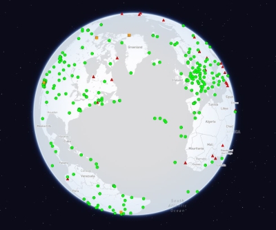
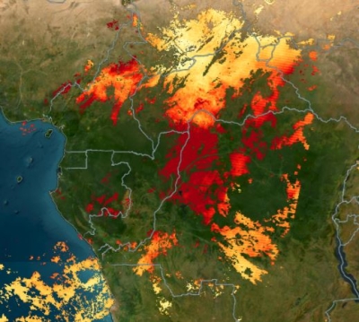
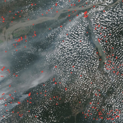
Along with the features mentioned above, Worldview's built-in functionalities allow uses to see, quite literally, the value of remotely sensed Earth science data. For instance, curated stories and tutorials highlight recent notable events and aspects of the Worldview application and provide users with a detailed overview of the wide array of Earth science, geographic, meteorologic, and remotely sensed information that satellite images provide. (Note: These tutorials are found under the Explore Worldview link in the information button’s drop-down menu.) There is also a catalog of natural hazards and events (found under the Events tab in the layers menu box), including wildfires, tropical storms, and volcanic eruptions that show how satellite imagery can be used to reveal the conditions that drive and sustain these phenomena.
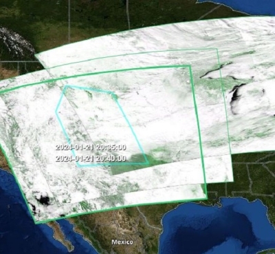
Further, Worldview gives users tools to create customized animations (GIFs) of satellite imagery showing the progression of natural phenomena and the ability to compare images from different dates to document environmental change.
How to Create Animations
Users can create animations by:
- Clicking the orange Add Layers button to filter by discipline, keyword, or natural hazard
- Selecting a layer (or layers) of interest
- Panning/zooming to a geographic region of interest
- Clicking on the video camera icon on the lower left corner
- Selecting the desired date range using the up/down arrows in the animation menu bar (or drag the start and end date indicators on the timeline)
- Adjusting the speed at which the animation plays by adjusting the frames per second and ensuring that the animation automatically replays by clicking the "Enable animation loop" icon
- Adjusting the sides of the box to select the desired size/area (users can also choose their desired resolution and whether they would like date stamps included in the GIF)
- Clicking the orange download arrow or Create GIF button to create the GIF
- Clicking Download to save the GIF
How to Compare Imagery
Users can compare imagery from two different dates, two sets of imagery from the same date, or even two sets of imagery from different dates by:
- Clicking the Start Comparison button (next to the orange Add Layers button), which will divide the screen into two sides (an A side and a B side)
- Adding layers and changing the date for the A side in the layer list by clicking on the active/highlighted A side and repeating this step for the B side
- Clicking the Swipe icon in the center of the screen and dragging the icon back and forth sideways to see the differences between the A and B side (users can also change the compare mode to Opacity, which will create a fade effect between the A and B images, and Spy, which opens a spyglass on the screen and restricts the comparison to the area contained within the spyglass)
- Clicking the Exit Comparison button to return to the normal view

Downloading Data
When users have finished exploring and viewing the available data layers and are ready to download the data they want, they can click the Data tab in the upper left side of the Worldview menu. Doing so will reveal a list of the user-selected datasets that includes links to details about each dataset from NASA's Common Metadata Repository (CMR; a high-performance, high-quality, continuously evolving metadata system that catalogs Earth science data and associated service metadata records).
Users will then be able to select which version of the dataset they want by clicking on the white circle to the left of the version title. Once their selections have been made, Worldview provides information on the total number of granules available for the user-defined area of interest, the number of granules selected from the total, and the size of the data download. The data can then be downloaded by clicking the orange Download via Earthdata Search button. This will bring users to Earthdata Search, where they can finish downloading the data they've selected by clicking the green Download Data button.

But Wait, There’s More!
The architects and developers operating behind the scenes to keep Worldview on the cutting edge of data visualization tools are always working on improvements and exploring new ways to help users view and discover the latest satellite imagery. As a case in point, Worldview was recently incorporated into the Earth Information Center at NASA Headquarters in Washington, D.C. In addition, Wong and her colleagues aim to add new capabilities to Worldview, such as allowing users to make time-series charts of certain imagery layers to view changes like sea surface temperature fluctuations over time. The Worldview team is also working with the NASA Interagency Implementation and Advanced Concepts Team's (IMPACT) Visualization, Exploration, and Data Analysis (VEDA) project to use their dynamic tiling service to provide custom visualizations (e.g., user-selected band combinations and vegetation indices) for specific data products.
Assistance and Resources
The information above provides a basic overview of how users can harness the capabilities of NASA Worldview to discover, visualize, and download NASA Earth science data. Given the application's expansive data catalog and myriad features, this article covers only the basics of using Worldview. Fortunately, there are several in-depth presentations and other resources available to help users make the most of this tool and its advanced features. In addition, there is a Feedback link in the Worldview menu under the information button that allows users to pose questions directly to the Worldview team.
- Tutorial: Introduction to Worldview
- Tutorial: Getting Started with NASA Worldview (December 2021)
- Webinar: NASA Worldview—Explore the Earth from Past to Present with Global Satellite Observations (May 2021)
- Animated GIF Tutorial: View and Share Your Planet with Worldview (April 2020) Tutorial en Espanol
- PDF: How to Use Worldview (November 2019)
- MODIS Video: NASA's Worldview: Two decades of Earth Data at Your Fingertips (June 2018)